Clear graphics for complex science.

Hello. I’m Andrés Alegría, a visual science communicator. My work blends graphic design with an academic background in ecology, where I first used research data to shape nature conservation policy and stakeholder engagement across Central America. I’m a tree hugger :-)

Examples

Open any of them to read it at full size.

Abastecimento de água e mulheres negras no RecifeMongabay Brasil · 2026
Jaguar range and Indigenous territories, BrazilMongabay · 2026
Blasting the Pedral do Lourenço, Tocantins RiverMongabay · 2025
Forest loss on Karipuna Indigenous land, 2019–2025Mongabay · 2025
Global leopard trade flows, 2000–2024Mongabay · 2025
Xiang Yang Hong 06 nears US territoriesMongabay · 2026
Nitrogen dioxide over northern ThailandMongabay · 2025
Biodiversity funding: gaps and growthMongabay · 2026
La Ola magazine: fisheries issuePublication design
La Ola magazine: the northern coast of HondurasPublication design
Handbook for AuthorsIPCC
Guía metodológica: zonas de recuperación pesqueraPublication design
How to Adapt to a Changing Climate: Summary for AllIPCC
Progress and gaps in climate change adaptation in coastal citiesNature Cities · 2024
The tragedy of climate change scienceClimate and Development · 2022
A global assessment of actors and their roles in climate change adaptationNature Climate Change · 2023
Towards an IPCC Atlas for comprehensive climate change risk assessmentsnpj Climate Action · 2024
Climate change on television reaches the engaged but misses distant audiencesNature Climate Change · 2026
Global and regional risks for increasing levels of global warmingIPCC AR6 WGII · 2022
Present and projected habitat losses of climatically suitable area in terrestrial biodiversity hotspotsIPCC AR6 WGII · 2022

Scrollytelling

Stories that unfold as you scroll

Map-driven features for Mongabay, built with Mapbox, React and GSAP.

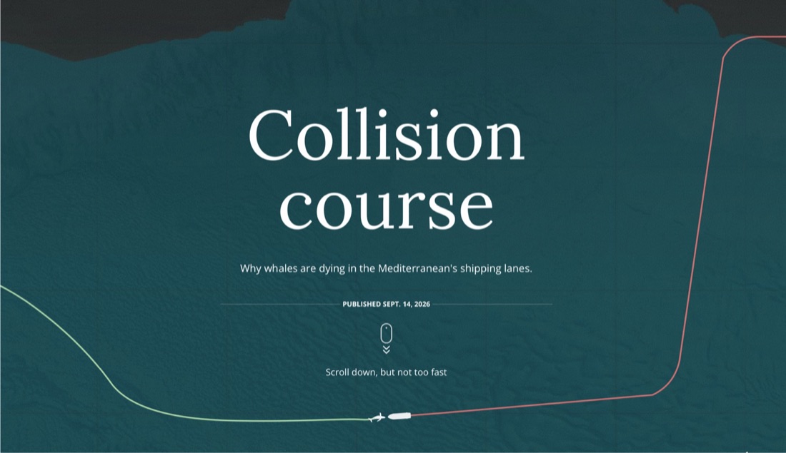
Opening screen of “Collision course”: a ship and a whale on converging tracks in the Mediterranean.

Mongabay · 14 Sept 2026

Collision course

Why whales are dying in the Mediterranean’s shipping lanes.

Read the full story

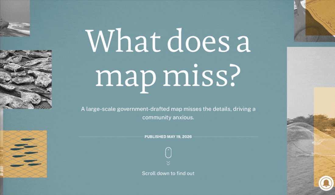
Opening screen of “What does a map miss?”, over a coastal zoning map.

Mongabay India · 19 May 2026

What does a map miss?

A large-scale government-drafted map misses the details, driving a community anxious.

Read the full story

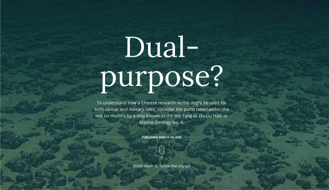
Opening screen of “Dual-purpose?”, over a photograph of the seabed.

Mongabay · 24 Mar 2026

Dual-purpose?

How a Chinese research vessel might serve both civilian and military roles, told through six months of its voyages.

Read the full story

All stories

Interactive 3D maps

Seafloors you can turn around

Bathymetry built from open elevation data, rendered in the browser.

The Mariana Trench in 3D

Mongabay

The Honduran Caribbean seafloor in 3D

Independent

Questions I get asked

How working together goes

Read the full FAQ

Can you design publication-ready figures, maps, and data visualizations for my scientific paper or environmental story?

Yes. I specialize in publication-ready figures and maps for scientific articles, reports, and environmental journalism. I regularly work with climate, ecology, conservation and social–environmental datasets and know how to translate complex results into clear, accurate visual stories.

For scientific publications, I follow journal guidelines (size, resolution, color profiles, typography) and deliver editable vector files (typically PDF, SVG, AI, or EPS) plus high-resolution PNGs or TIFFs for submission systems. For media outlets, I adapt the same graphics to work well both on screen and in print, including variations for social media or story headers when needed.

I can help with maps, charts, infographics, schematics, and multi-panel figures – from first sketch to final layout – so that your visuals are both scientifically robust and visually consistent with your paper, report, or article.

I already have my data (spreadsheets, R scripts, or GIS files) or preliminary graphics. How can you help me turn it into clear, accurate graphics?

Most of my projects start exactly like this: you already have the data and analysis, and perhaps a few graphic outputs, you need help turning them into clear, story-driven visuals.

You can send me spreadsheets, R/Python outputs, GIS layers (QGIS, shapefiles, GeoPackage, GeoJSON), or dashboard exports. I first review the material and ask a few targeted questions about your key message, audience, and constraints (journal guidelines, report format, platform, etc.). Then I propose a set of visual options: which charts or maps make sense, which comparisons to highlight, and how to simplify without losing scientific nuance.

From there I create design drafts – for example, map layouts in QGIS/Mapbox, charts based on your data, or schematic diagrams summarizing your framework or methods. You stay in control of the analysis and interpretation; I focus on visual clarity, accessibility, and accurate representation of your results. Final files are delivered in formats you can directly use in manuscripts, presentations, StoryMaps, or web articles.

How do you work in terms of pricing, timelines, and remote collaboration with clients across the world?

I work with clients internationally, so almost all of my projects are remote. We usually start with a short call or email exchange where you describe your project, share sample material (data, draft figures, article outline), and tell me about your deadlines and target outlet (journal, report, media story, etc.).

Pricing depends on scope and complexity: for small, well-defined tasks (for example, polishing a single figure or map) I often propose a fixed price; for larger projects (a full set of figures, a report layout, or an interactive piece) I estimate based on expected days of work. In every case, you receive a clear quote before we start, with what’s included (number of figures, feedback rounds, file formats).

For collaboration, I’m flexible: we can work via email, shared folders, or your preferred project tools. I send drafts at key stages so you can comment, and we iterate until the visuals match both your scientific standards and your communication goals. I’m based in Germany (CET), but I regularly coordinate with teams across different time zones.

Contact

Have a dataset, a draft figure or a story in mind?

I enjoy translating scientific information into clear and visually engaging graphics. I usually collaborate with researchers, scientists and journalists covering environmental conservation topics such as fisheries, biodiversity and climate change.

Feel free to get in touch. I’d be glad to discuss how we can bring your project to life.